Solar-Panel Hackathon
Published on 18.04.2026
Solar power is one of the best energy sources available, but currently it comes with a grid problem: Peak generation happens midday when the sun is highest, peak consumption however happens in the morning and evening. Energy storage helps to store the power, but it comes with other problems: when the batteries are fully charged and switch to putting the power in the net, there is a spike and equivalently in the evening, as the batteries run low, the energy grid sees another sudden spike in load rather than a gradual rise. The result is significant stress on cables and transformer stations. Stress that worsens with every new installation. Energy providers like Badenova Netze have to upgrade infrastructure when this stress appears. Doing it reactively is expensive as it needs to be done quite quick, without much planning. The better approach would be to predict which parts of the grid will need upgrading before panels are installed, so providers can act rather than just respond. That was the problem Badenova Netze brought to the BlackForest Hackathon 2025 in Freiburg. My team chose it because it sat squarely at the intersection of machine learning and real infrastructure impact and because we underestimated how much of the weekend we'd spend learning GIS from scratch.
The Problem
The task itself wasn’t that complicated: we were given a ton of geo data and should derive some metric how much solar capacity was going to be installed in which places. In our eyes this was solvable with a classifier, that would find the houses, that would install solar panels in the future, sounds simple. The complexity however came with the data: it consisted of energy-net related data such as transformer stations, cable distributions, existing solar capacity and the capacity of not-used roof areas, house characteristics and demographic data, such as age or even affinity for energy related topics per house and naturally those consisted of GeoJSON-Points, -Polygons and -Lines that weren’t nicely aligned.
So this was the first challenge for us: creating a dataset we could use for a Machine-Learning Pipeline. This included learning, what exactly GIS was and how you can work with such data. When we later split our attention, a part of our team worked on deriving insight on possible features and relations to external factors from the data using GeoPandas, while the others tried to create the training dataset with DuckDB. However after fixing an error after another in the DuckDB-pipeline without gaining ground, I pivoted to another approach using QGis and the first message when loading the single datasets was for some that they had corrupted passages, which explained all of our previous issues. After having those corruptions fixed by QGis I merged the different datasets and then we finally had our dataset on which we could have trained a classification model, like a RandomForest, but I noticed, that there was a fundamental flaw in how we’d framed the problem.
The Insight
At that point we had two labels for our house-level dataset: “installed solar panel” and “no installed solar panel”, but when I thought about, what our model should derive from the data I noticed that with this usual approach we would have trained the model to find the houses that already have installed solar panels, which excludes the houses that are going to install panels in the future, as our negative label was more a “no installed solar panel yet”. This transformed this problem, which seemed like a standard ML-Problem to a Positive-Unlabeled (PU) Problem, as we had one class that definitely is positive (has solar panels installed) but we don’t really know about the other, as they could install them the next day, which leaves our instances without solar panels rather unlabelled than negative.
The Method
PU-Learning is a technique of machine learning that uses some probabilistic theory to derive a traditional model (with positive/negative results) from a model trained on the PU-Data (https://cseweb.ucsd.edu/~elkan/posonly.pdf).
The first step mirrors a naive approach: train a classifier to distinguish confirmed positives from unlabeled examples. But where a standard model stops, PU Learning takes a next step: The probabilities from this first classifier are used to reweight the unlabeled samples, houses that look like hidden positives get upweighted, others are downweighted. A second classifier then trains on this reweighted data, producing probabilities that reflect the true likelihood of adoption rather than just similarity to already-confirmed cases. The parameter c controls this reweighting: it encodes the prior belief about what fraction of unlabeled houses will eventually adopt solar. We set it to 0.5, which was more of a judgment call under time pressure, not a validated estimate.
Another assumption of this approach that should be noted is, that the labeled positive examples are chosen randomly from all positive examples. This is in our particular case not true, as our positive and unlabelled positive examples are separated by when they install their solar panels, but at that time, this was still our best guess.
The Result
After applying this method with an XGBoostClassifier to our data during the last night of the hackathon, we were relieved to have a result that seemed reasonable. Our data was built on the following features: The impact of price and environmental protection on purchasing decisions, affinity for electric mobility, purchasing power index, building age category, and building characteristics, as well as the most common age of residents.
In the following results the houses are marked as follows: Yellow: Already Solar Panels installed; Grey: Unlikely to install Solar Panels; Green: Likely to install Solar Panels
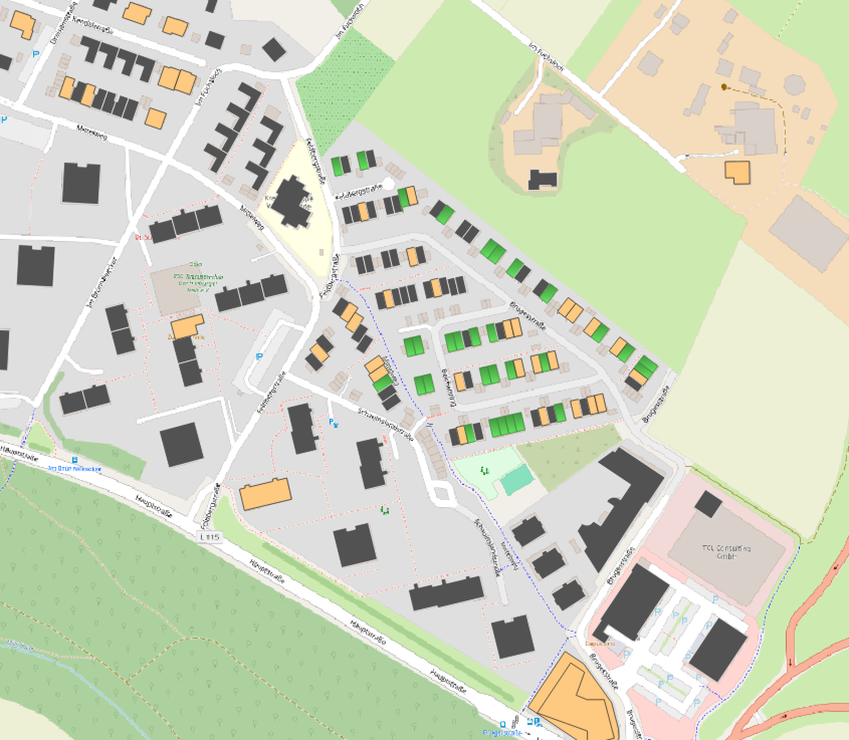
As this screenshot of our result visualized in QGIS shows, there are a lot of houses where our model predicted an adoption of solar panels in the north-east of this village in contrast to the other parts. When looking at this area with Google StreetView you notice that the north eastern part are mostly newly built homes in contrast to the older buildings in the rest of the village. As photovoltaic panels are mandatory for new built houses in Baden-Württemberg since 2022 this distribution makes total sense and validates that reasoning of our model. This is consistent with our earlier data analysis, which showed sharp increases in adoption rates following subsidy programs and the 2022 legislative mandate.
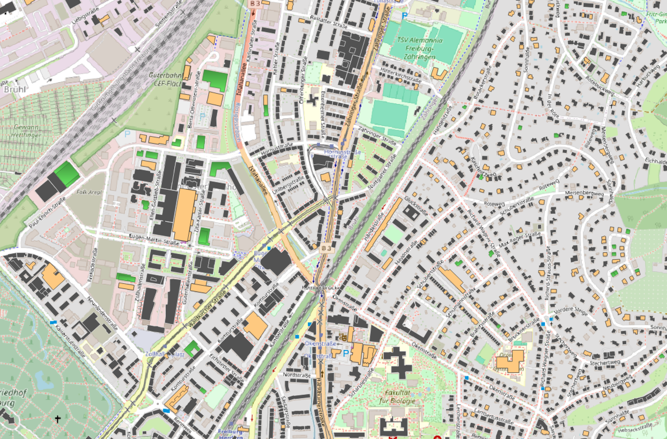
Generally the picture is much more looking like this in established areas, with only some houses classified as adding solar panels and already quite a bunch having panels installed, which again seems reasonable from my point of view, as on the left here in the more industrial area, there are more buildings likely to adopt solar energy, which fits to my own observations in my local area.
Looking at this it should be mentioned that there were some houses without the needed data, which is why they aren’t marked at all on this map.
The Reflection
Looking back, the biggest technical gap was our choice of c. Setting it to 0.5 was a guess. A reasonable one under time pressure, but still a guess. With more time, we could have derived it from the data or used domain knowledge from Badenova Netze about actual solar adoption rates in the region. Similarly, understanding the features more deeply would have allowed for better selection and refinement. We largely trusted what the dataset gave us. The weekend also gave me my first real exposure to GIS, something I had no experience with beforehand. Working with GeoPandas, QGis, and corrupted spatial data under a deadline was a crash course I am now quite glad I got. After all, predicting adoption rates is only half the problem. The genuinely useful version would cross-reference those predictions with the infrastructure data we were given: which transformer stations and cables serve those houses, and what their current load capacity is. That connection would turn a prediction into an actionable upgrade plan for the grid.