Analysis of Forest Health
Published on 23.02.2026
Forests across Central Europe are dying faster than most people realise. The causes are known: climate stress, drought and bark beetle outbreaks. However, the scale and speed of change is often not recognised until the damage is already visible. When I learned that satellite sensors can detect shifts in vegetation health long before the human eye can, I knew I had to find out if machine learning could catch these changes early enough to make a difference. This project was my attempt to find out. It didn't go as planned. And that turned out to be the more interesting version.
The Original Plan
Initially the plan was to perform supervised learning distinguishing degraded or dead from healthy vegetation, apply the trained model to the complete black forest and publish the results on an interactive map on this website.
For this goal the first hurdle was the SentinelHub API, as this was the first time I had to write code for such a complex API. In addition, my Area of Interest (AOI) at that time covered the complete Black Forest, which meant that I had to write tiling logic for the requests to be able to fetch the bands for the complete area. Tiling the AOI also wasn’t as easy as I had expected: it required some standard GIS operations, which I was also quite unfamiliar with at that time. When I finally had learned enough GIS and got the fetching pipeline to run and deliver the results I needed, I was thrilled to finally have the base to get to the part I had been looking forward to: the supervised training. What I hadn't solved yet was where the training data would come from, and that turned out to be a much harder problem than the API.
Where Supervised Learning Fell Apart
With the satellite data stored I started looking for ground-truth to get the necessary training labels. At that time I only found the waldmonitor. This project uses a threshold based on NDVI differences between years and as that was a simpler approach than what I was going for, I considered that project as not suited for ground-truth and was left without any other option.
This was the first dead-end of this project and led me to think about a two-step system: filtering forest areas from other landtypes with a supervised system and performing an anomaly detection on the remaining pixels. However, while starting to label the training data manually with polygons, I realized that this was solving a problem that had already been solved, as there were many sources online that represented exactly what my supervised system would have produced in its best-case. This was the reason to switch to the ESA-Worldcover for masking forest pixels.
Forced To Resize & Focus
Once I had found a way to mask the forest pixels, I started thinking about the features I wanted to extract from the various indices I had fetched from the API. I quickly realised that I would need temporal features that could cancel out seasonal and temporary developments, while capturing long-term developments. Another advantage of temporal data was that it would enable me to address cloud cover of forest patches through temporal interpolation, a problem I had encountered when working with a single timestamp.
However when I fetched the data for the complete Black Forest region I spent all my monthly available API-tokens on a single timestamp. This meant I had to drastically reduce the AOI to be able to fetch multiple timestamps to achieve temporal features, when I wanted to stick to the freely available data and not spend money. Looking at the waldmonitor there are some areas visible that definitely have degraded areas and one of those is located in the heart of the Black Forest National Park, just south-east of the Hornisgrinde. This region would later reveal patterns I hadn't expected.
Band & Feature Analysis
The data I was working with consisted of remote-sensing vegetation indices. They combine different spectral bands and normalize them to represent a range of different characteristics of vegetation, such as the chlorophyll content, which is represented by the NDVI. The first major analysis step was to get a feel for what each index represents and derive meaningful features for the clustering. Using the evalscript feature from the SentinelHub I calculated the following set of features as a starting point: SAVI, EVI, NDRE705, NDRE740, NDRE783, NDVI, NDWI (Gao), NDWI (McFeeters), NBR. Some, like the McFeeters NDWI, may seem displaced with the set goal, but as I had other plans when I wrote the API code they seemed reasonable at that time, to e.g. distinguish forest from water bodies.
In the analysis I looked at different levels of the data: first understanding how a single pixel behaves and how the interpolation is correcting cloud coverage, then the overall AOI trend, to understand how each index behaves over time over a large area and lastly the spatial distribution of possible features for the clustering.
Single Pixel Behaviour
This plot shows the NDWI per month for a single pixel, starting in January ‘20 and ending in September ‘25. The blue line represents the raw index, while the red shows the interpolated values, where cloud coverage was corrected using linear interpolation between adjacent timestamps. With this plot it is quite obvious that in the summer of 2023 (month 30) there seemed to be some disruption, from which the forest patch did not recover. This kind of drop was the motivation for the “difference between time intervals” feature that is mentioned below. The spikes after that drop are in winter months and most likely due to snow cover.
Overall AOI Index Trend
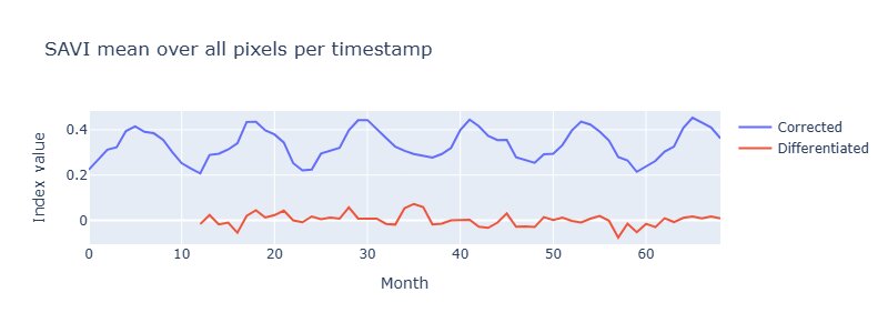
This plot shows the SAVI per month averaged over all pixels. Here it is quite obvious that SAVI is a seasonal feature. An Augmented-Dickey-Fuller test confirmed that seasonality (p=0.46), which meant differencing by lag 12 was necessary before using SAVI as a feature in some circumstances.
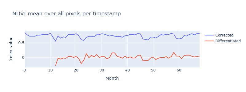
This plot shows the NDVI per month averaged over all pixels and in contrast to the SAVI this is not affected by seasons, which is also indicated by a p-value of 7.68e-06 when performing an Augmented-Dickey-Fuller-Test.
Those plots are able to give an idea, which values are “usual” in that area and if there were major disruptions that affected the complete AOI. However with those plots it does seem like most of the forest in that area is not degrading and staying healthy.
Spatial Distribution of possible features
Mean over last 12 months (from September ‘25) per Pixel
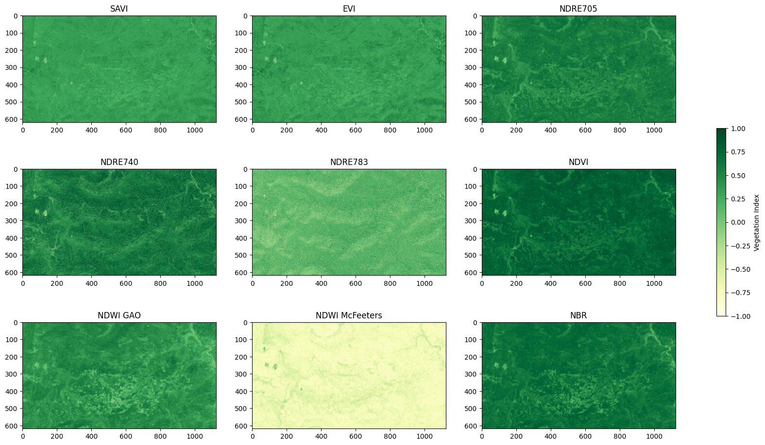
This plot visualizes the mean per pixel over the last 12 months (calculated from the end of the data in September 2025). In those plots there are already degraded areas visible. For example the NDWI shows clearly lighter spots in the lower center of the area.
The feature-selection was based on plots like this to validate if a feature has plausible spatial structures when compared against degradation patterns visible in the Waldmonitor. In the case above, NDVI and NDWI, in contrast to NDRE783, show a clear structure, which is related to the degraded areas that are visible on the Waldmonitor site, which is why they were chosen as features for the clustering.
In the end I selected these five features:
- Mean NDVI (last 12 months): Average chlorophyll content in recent period
- Mean NDWI (last 12 months): Average water content in recent period
- NDWI Change: Difference between recent 12 months (~2025) and first 12 months (~2020)
- Temporal Variability (SAVI): Standard deviation of SAVI over the year
- Spatial Variability Change: Change in local NDVI heterogeneity (5×5 window)
The selection was guided by spatial plausibility rather than a formal optimisation, meaning other combinations may perform differently or even better.
If you want to get to know more about this I highly recommend the band_eda.ipynb notebook in the notebooks/ folder of my repository.
Clustering Analysis
Before starting the clustering, a university project gave me the opportunity to test exactly this question on a smaller scale first. However we had a lot of freedom when choosing the clustering dataset we wanted to work on, so I naturally chose a problem that would contribute to this bigger project: distinguishing between built-up areas and vegetation on the grounds of our university.
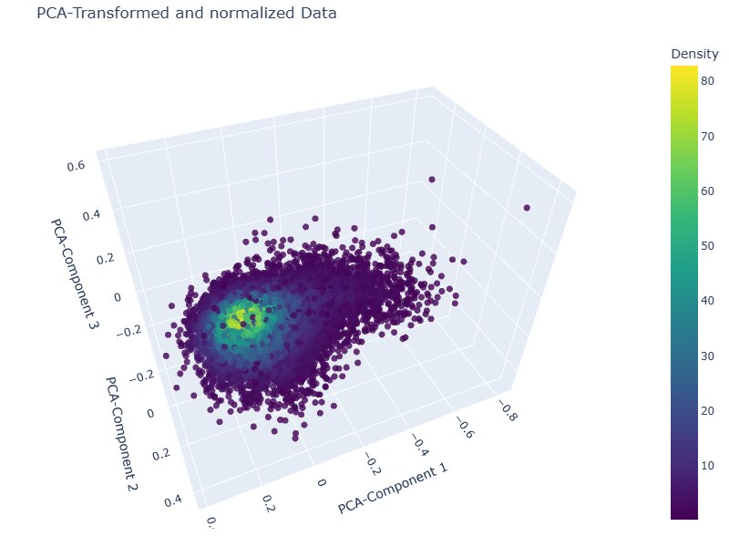
During this project I learned that such remote sensing indices are mostly continuous with values all across the spectrum, which results in more of a continuous blob with elongations rather than densely separated clusters, like DBSCAN and OPTICS expect them. A PCA visualisation of the feature space confirmed this: the data forms one continuous elongated distribution rather than the separated clusters that density-based methods require.
After applying those learnings to this problem, I chose k-Means with kmeans++ initialisation, discarding Agglomerative Clustering due to memory constraints. The elbow plot showed no sharp inflection, which was expected given the continuous nature of the data, but two subtle kinks were visible at k=2 and k=4. Four clusters offered more granularity than a binary healthy/degraded split without over-segmenting.
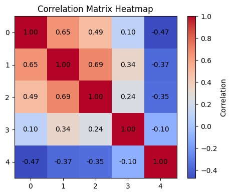
Before running the clustering, features were normalised using a Min-Max-Scaler and checked for inter-feature correlations. While some moderate correlations exist between the vegetation index features, the spatial variability feature shows a negative correlation with the rest, suggesting the feature set captures meaningfully distinct dimensions of forest condition rather than redundant signal. One known limitation worth acknowledging: spatial autocorrelation between neighbouring pixels was not explicitly addressed, which is an inherent constraint when applying k-Means to raster data.
If you want to dive deeper into the methodology or look at further explanatory visualisations, I can highly recommend a look into the corresponding notebook in my repository.
Results:
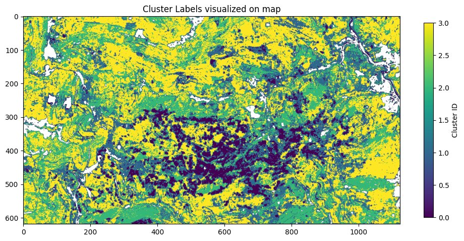
In this plot there are the four clusters visualized on a map. It is obvious that there is a large conglomeration of patches that got clustered in one cluster labelled as 0. Around those 0 labelled patches there are often areas labelled with 1 and the rest of the AOI is split between the clusters labelled with 2 and 3.
Feature-Ranges per Cluster
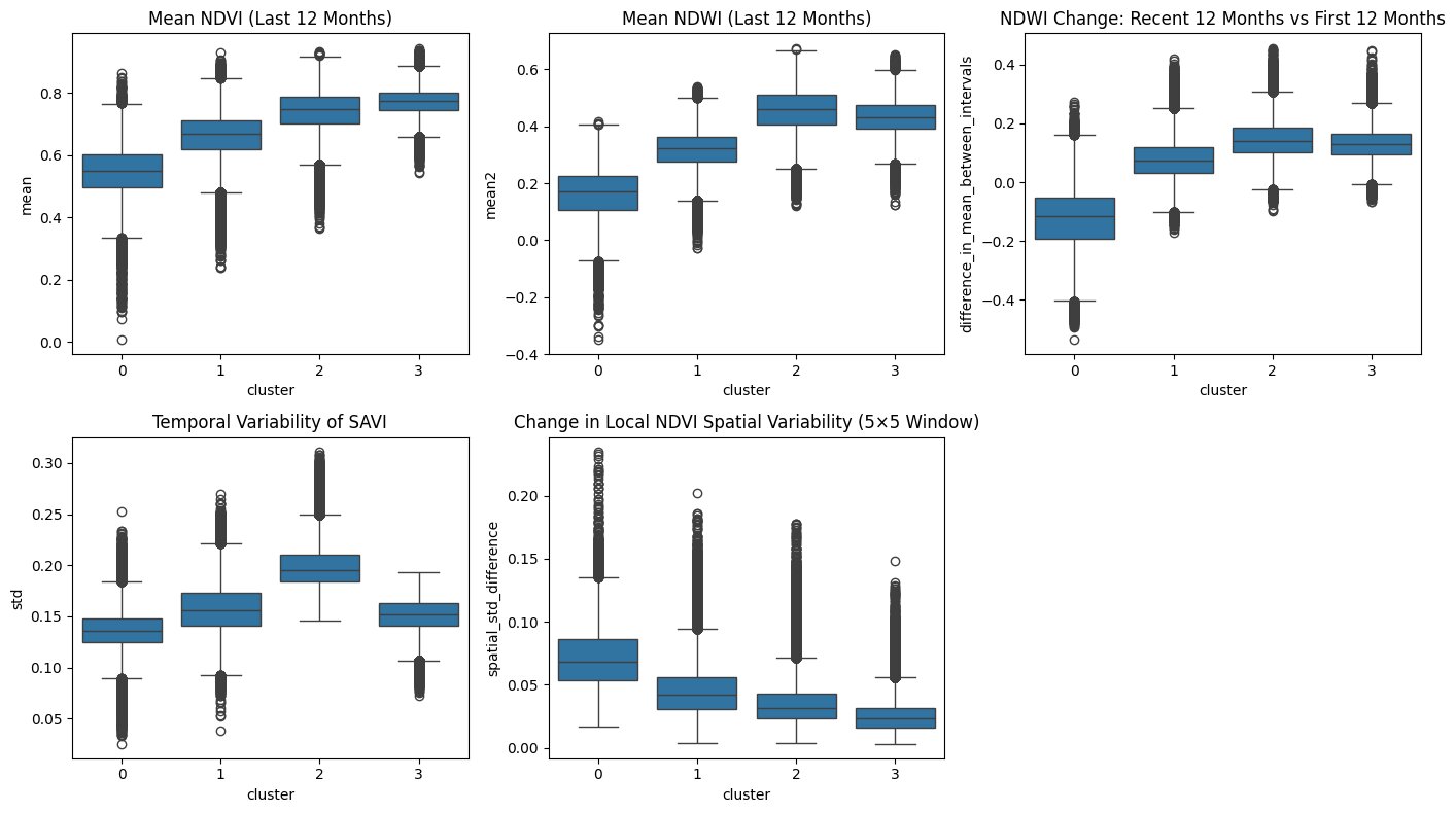
Looking at the feature ranges for those clusters it is possible to extract the characteristics of those clusters:
Cluster 0 captures the most severely degraded areas. Low mean NDVI and NDWI indicate reduced chlorophyll activity and water content, while the negative NDWI trend shows continued deterioration over the five-year period. Low temporal variability in SAVI reflects the absence of normal seasonal growth dynamics, which is typical for dead or heavily stressed trees. At the same time, high spatial variability points to a patchy structure with scattered surviving trees rather than uniform clear-cut areas.
Cluster 1 sits consistently between the extremes. Across nearly all metrics it falls between Cluster 0 and the healthier clusters, supporting the interpretation of a transitional state. These areas likely represent moderate stress or partial mortality, no longer fully stable but not yet collapsed.
Clusters 2 and 3 represent healthy forest conditions, with high NDVI and NDWI values and stable or positive trends. The difference lies in structure. Cluster 2 shows stronger temporal variability and broader index distributions. Cluster 3 appears more uniform, with lower variability and tighter distributions, suggesting a structurally consistent canopy. The difference in temporal variability could reflect forest composition. Cluster 2 potentially representing deciduous-dominated or mixed forest with pronounced seasonal cycles, while Cluster 3 represents evergreen-dominated forest with more stable year-round canopy. To be sure about that it however would require validation with forest inventory or land cover data.
External Validation
During further research I found Deadtrees.earth, a University of Freiburg project that maps standing dead trees using ML models applied to aerial imagery. Unlike the threshold-based Waldmonitor approach I compared against earlier, this felt like a much more honest benchmark: a supervised ML model built with labeled ground-truth I never had access to. Their results are also based on Sentinel-2 data, which makes the methodological contrast sharper: same source data, completely different approaches. The spatial agreement was clear: where they detected high dead tree density, my clustering labeled those pixels as severely degraded, and where they showed moderate mortality, I had a transition cluster. Two independent methods, no shared labels, consistent conclusions.
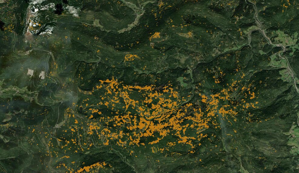
Source: https://deadtrees.earth/deadtrees (accessed 16.02.2026)
For a project built without ground-truth, under API rate limits and with only my own thinking to challenge my decisions, seeing those results line up with a professionally built supervised model was one of those moments I hadn't dared to expect.
Whilst working on the clustering I also noticed that my GIS knowledge was barely reaching the minimal needed amount, so I invested some time reading the PythonGis book. On the last pages, they introduce a bigger case study: a watershed analysis of the New Zealand Alps and as I saw it, I immediately started questioning whether the tree degradation in my AOI was somehow linked to topography and with that my next steps were laid out in front of me.
DEM Analysis
My main goal of this analysis step was to evaluate whether topographic features stand in some relationship to the degradation patterns my clustering found. For that the first step was quite obvious: topographic features. Those are the features I selected: Elevation, Slope (degree), Aspect (degree), Northness, Eastness, Topographic Position Index (TPI), Topographic Wetness Index (TWI), Upstream Contributing Area in m² (UCA), logarithm of UCA with base 10 and Distance to next stream.
Visualizations of all the features
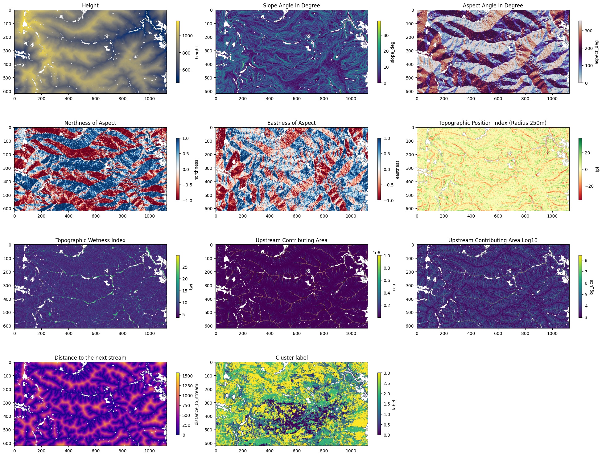
The plot in the bottom center shows the cluster labels overlaid on the topography and while the degraded cluster (0) is clearly spatially concentrated, it does not follow any obvious topographic boundary like a ridge line or valley, which already hinted that the relationship might be weaker than expected.
Again if you want to go into more detail of this step, please have a look at the corresponding notebook. In there I also go into more detail on what each feature represents.
With those features at hand, the next step was to compare their values along the clusters:
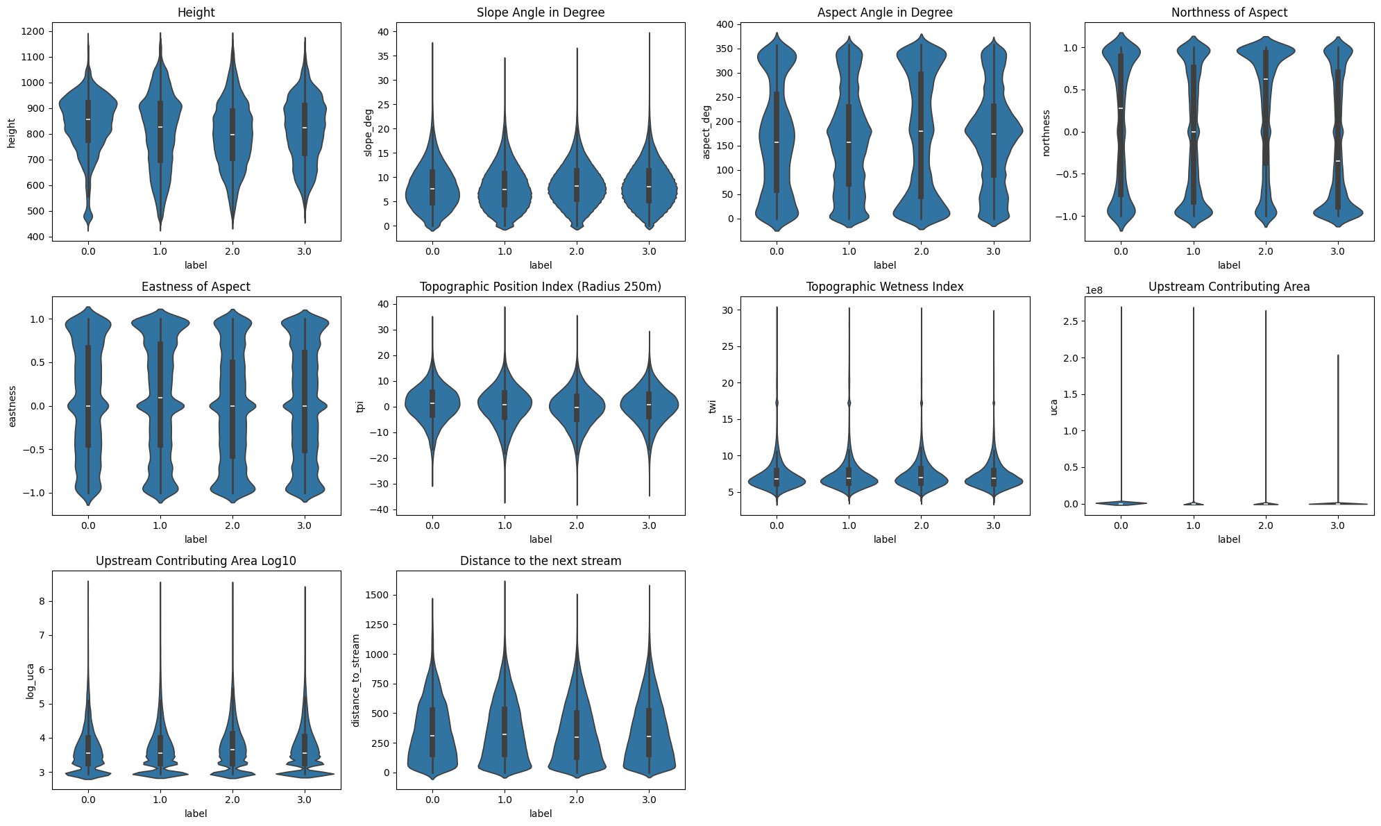
Most of the features have very similar distributions across all cluster labels, but there are still some patterns and differences.
The degraded cluster (0) has a much higher density around ~920m of elevation, in addition to the cluster showing a semi-degraded state having a slight density bump at that elevation as-well. This suggests that trees at elevations around that range may be particularly at risk, though no general altitudinal gradient is apparent.
The biggest differences in those plots is visible when evaluating the aspect and its components. Cluster 2 and 3 have very distinct northness distributions. Cluster 2, previously hypothesized to potentially represent deciduous-dominated areas, shows a notably northern orientation, while Cluster 3 leans southward. If this compositional interpretation holds, it would suggest that in this area deciduous trees preferentially occupy north-facing slopes while south-facing slopes are dominated by evergreen species, but cannot be confirmed without additional species distribution data.
Slope Angle, TPI, TWI, UCA and Distance to next Stream show no clearly visible differences.
Next to this visual analysis, I also wanted to apply a more sophisticated statistical test. For that the Kruskal-Test seemed reasonable as it ranks the cluster labels based on a given feature and then calculates the deviation from a distribution that wouldn’t have any cluster ordinal structure.
With that every single feature was considered statistically significant, but this is due to the high instance count that even small deviations make it significant. However, as shown by ε², northness is the best predictor by far with only ~5% of rank variance explained, indicating that topographic features are only weakly associated with cluster membership and therefore with forest degradation state, from that perspective.
Another test was to fit a logistic regression on the cluster labels with a reasonable subset of the topographic features, but that model had a McFadden R² of roughly 0.007, barely above a null model, which is another indication that topography is not the major driver for forest degradation.
Topography, it seemed, was not the answer.
This was contrary to my belief when I started that analysis, but I guess this is how research goes: sometimes your hypothesis doesn't hold and those are still results, which are able to tell a story. However in this case the story was left unfinished, which felt quite unsatisfying. But there was one interesting aspect left: the spatial concentration of degraded pixels, clustered around specific ridges and that ~920m elevation band, suggested something else was still driving the pattern. Something more biological than geological.
The missing factor?
I was always aware that my AOI covered a lot of the heart of the Black Forest National Park. I also knew that there were bark beetle outbreaks in that general area, but when I read that the National Park management deliberately refrains from taking measures against bark beetles, except for a buffer zone around the edges, my mind latched onto a hypothesis: what if the degradation was due to bark beetles?
This hypothesis holds together in a way that feels hard to dismiss. It explains why topographic and hydrologic features showed no meaningful relationship with degradation. It explains the spatial coherence of the affected areas. And it explains why such a large degraded patch appears in this AOI specifically: most surrounding Black Forest regions are economically managed and treated against bark beetles. The National Park is not. Confirming it would require ground-truth data or species-level remote sensing, neither of which was available here. But the FVA Baden-Württemberg documents elevated bark beetle trap counts across multiple monitoring stations directly within my AOI over several consecutive years. The convergence of evidence, spatial coherence, documented beetle presence, deliberate non-intervention, is compelling enough to treat this as more than speculation.
Project-Structure & Software-Engineering
During the course of that project, I faced some dead-ends where I needed to re-assess which parts of my project could still be used or needed refactoring. It was just then, that I realized how valuable principles like Single-Responsibility-Principle with a good project structure are. Mostly I just changed how the classes were interacting with one another and the existing code held up well. I didn’t need to restructure huge parts of the code I had written prior.
Parallel to this project I had a Software-Engineering course at University and learning about Design Patterns proved to be quite valuable as well. For example the Feature Calculators are using a Template Method Pattern so that the main feature calculating class can just call a single method, without needing to know what calculator is actually behind that. This was also only made possible by defining the features through a pydantic model, which I had used in a previous project at my job, but setting such a structure up from scratch is a whole different story, than migrating DB-schemas.
More than anything, this project taught me what it means to own a codebase end-to-end, from the first API call to the final analysis, with full autonomy and no senior developer to fall back on.
Lessons learned
I guess the first lesson I learned is quite obvious: research much more before committing to a plan, as a way to evade dead-ends. But as much as such hard-stops can be demoralizing, in this case they were mostly lessons to learn, and learning was one of the main reasons I began this project. So I wouldn't consider pivot points a no-go failure. Sure, they consume a lot of time, but reflecting and rescoping is much more reasonable than sticking head-first to a plan, which would possibly even lead to worse results.
The second lesson I learned is not to be stopped by the scale or seemingly high complexity of a project. When I started I had to learn how to fetch data from the SentinelHub API and I knew barely anything about GIS, but during the course of this project I added a few more skills to my repertoire that I can develop further as I need them. Because one thing is clear: environmental analysis paired with AI is definitely something I will continue working on.
On that note, I already have some ideas swirling in my head, but in that case, it is better to show than tell. And there is one hypothesis I would still like to validate with a small field-trip in spring: whether the north-facing slopes in my AOI are indeed dominated by beech, which would support the compositional interpretation of Cluster 2 and that would be a finding I wasn't able to locate in any research paper.
Whatever the outcome, at least one thing this project made clear: this is the kind of work I want to keep doing and I am far from done.